
Brand Guidelines · v1.0
Sapxifi helps enterprises get more from SAP, the people who run it, and the AI that comes next. The brand should feel engineered, calm and quietly confident, like a partner who has done this many times before.
Two disciplines meet at one point: deep expertise and forward motion. That meeting point is the X.
Personality
Pillar 01
Strategy. Implementation. Continuous value.
Pillar 02
Right people. Real impact.
Pillar 03
Intelligent solutions. Real outcomes.
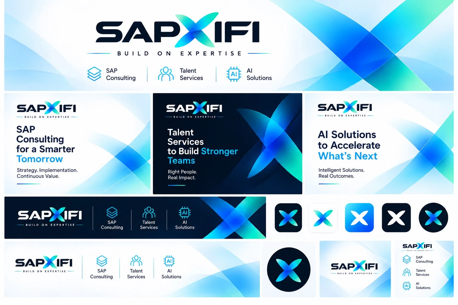
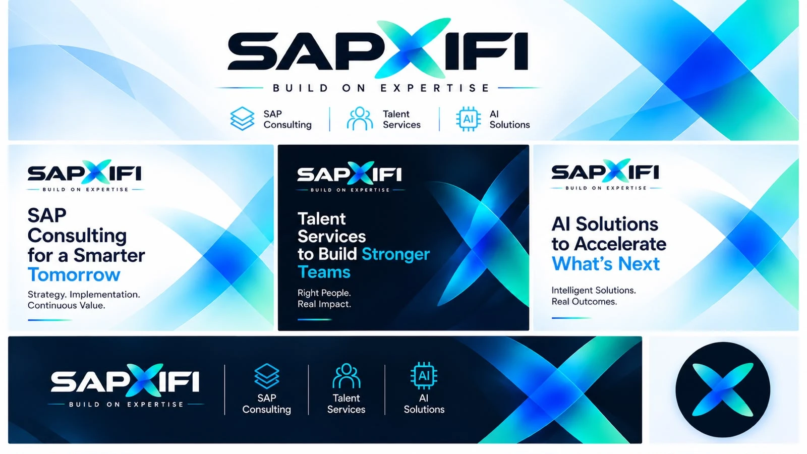
The wordmark sets SAP and IFI in a wide, heavy geometric face. Between them sits the X: two translucent blades that cross at one point. Use the full lockup with the tagline wherever there is room, and the X on its own for avatars, favicons and app icons.
 Primary · on whiteReversed · on navyWordmark · no tagline

Keep clear space on every side equal to the height of the "S" cap (marked x). Minimum width is 120px on screen and 30mm in print for the lockup with tagline. Below 160px wide, drop the tagline and use the wordmark.
Don't stretch or squash the logo.
Don't recolour the X or the letters.
Don't place it on low-contrast mid-tones.
Don't rotate it or add effects.
Navy and white carry the brand. The X gradient (mint, cyan, electric blue, royal) is the light source: use it for the mark, ribbons, highlights and one key word per headline. Never use it for long passages of text.
#05122E · RGB 5 18 46#030A1C · RGB 3 10 28#0A2BC9 · RGB 10 43 201#1E6BFF · RGB 30 107 255#16D4FF · RGB 22 212 255#2EE6C0 · RGB 46 230 192#EAF4FF · RGB 234 244 255#4A5878 · RGB 74 88 120Usage ratio
X Gradient: mint › cyan › blue › royal
Night: dark hero backgrounds
Daylight: light hero backgrounds
Sora's open geometry echoes the wide wordmark without imitating it. Inter keeps long-form content readable. Both are free Google Fonts. The wordmark itself is artwork: never retype it.
We help enterprises plan, implement and run SAP, bring in the people to make it stick, and put AI to work on the problems that matter.
A 1.75px stroke on a 48px grid with rounded caps and joins. Fill them with the blue › cyan gradient, or use them in white on dark. Each pillar has its own anchor icon.
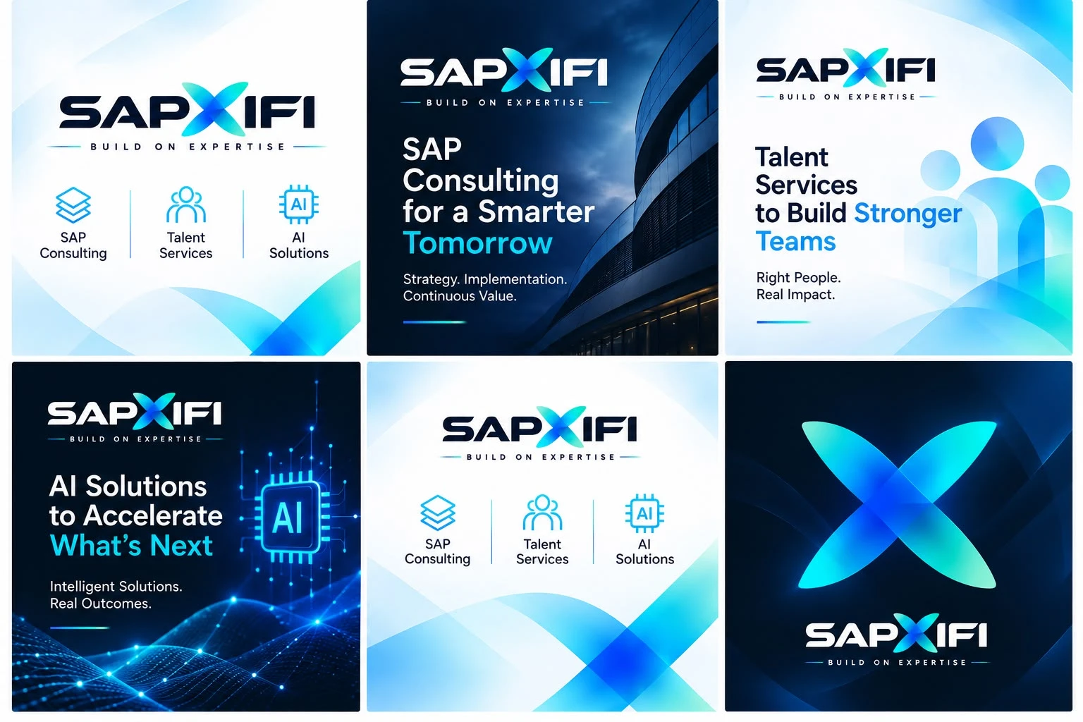
The visual world mixes two moods: bright, airy daylight surfaces crossed by translucent blue ribbons, and deep navy night scenes lit by cyan signals. Photography is architectural, real and uncluttered, never cheesy handshake stock.
 Signature ribbons · night
 Architecture · dusk, glass, curves
 AI · circuitry, particles, glow
 Talent · abstract, inclusive
 Signature ribbons · daylight
#05122E#16D4FFWe write like senior consultants talk: plain, specific and outcome-first. Short sentences. Paired phrases with full stops ("Right people. Real impact.") are a brand signature, so use them for sign-offs and taglines.
We say
"We'll get your S/4HANA migration live without stopping the business."
We don't say
"We leverage best-in-class synergies to empower holistic digital transformation journeys."
Show we know the detail, then explain it simply.
No exclamation marks or superlatives we can't prove.
"We" and "you". Talk about people as well as systems.
Buttons
Buttons on dark
16px radius, 1px Ice border, soft navy shadow on hover. Icon on top, Sora title, Inter copy.
Spacing & radius
8px base grid. Sections 96–120px tall on desktop and 64px on mobile. Radii are 10 for inputs, 16 for cards, 28 for feature panels, and full pills for buttons.
One headline, one gradient phrase, a two-beat sign-off, and the gradient rule. The logo sits top-left. Ribbons enter from the right.
Strategy. Implementation.
Continuous Value.
Right People.
Real Impact.
Intelligent Solutions.
Real Outcomes.
Source references supplied by the client